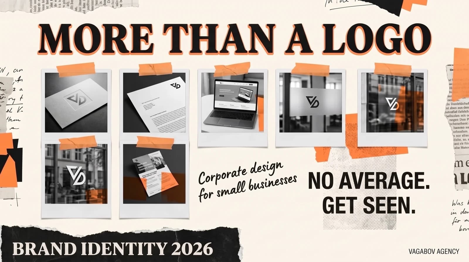
A typical request: “Can you make us a logo?” Sure, I can. But there is usually a bigger goal behind the question: the business should look more professional, inspire more trust and stand out from the competition. A logo alone can’t do that — it is just one building block. Corporate design is the complete visual language of your company, from color to photography, from letterhead to Instagram post.
And this language works fast. A study from Carleton University in Ottawa (Lindgaard et al., 2006) showed that people judge the visual appeal of a website within about 50 milliseconds — and that these snap judgments closely match what they say after looking for longer (report in Nature). In this article, I explain what corporate design for a small business consists of and how you build trust through consistency.
Why corporate design goes beyond the logo
Imagine a restaurant: the menu is printed on flimsy paper, the napkins don’t match anything, the plate has a crack. But the logo on the door is beautiful. Do you feel comfortable? Exactly. A logo alone doesn’t create atmosphere — only the interplay of all the elements builds trust.
Corporate design rests on five pillars: colors, typography, imagery, shape language and the layout grid. The logo is the signature that holds everything together. Each pillar sends a message, and only together do they form a picture people recognize. If you only invest in the logo, you have done the smallest part of the work.
Color systems: impact by design
Color is often the first thing people notice about a brand. That is why a well-thought-out color system doesn’t consist of “two colors the boss likes” but of a reasoned palette: primary color, secondary colors, accent color and neutrals — each with a fixed job, such as “accent only for buttons and important notices.”
Many colors carry learned associations: blue is seen as serious and stable and is common among banks and insurers, many people associate green with nature and sustainability, and orange with energy. These associations are culturally shaped, though, not laws of nature. What matters more is that the color fits your positioning and sets you apart from your direct competitors. If every tax advisor in your town uses blue, blue no longer sets anyone apart. And be careful about copying well-known brand colors: colors can be protected as trademarks — Deutsche Telekom’s magenta is the best-known example.
You’ll find more on how colors work on websites in the article on color psychology in web design (in German).
Typography: type as your brand’s voice
A typeface is never neutral. A high-contrast serif such as Playfair Display looks elegant and traditional, a clean sans serif such as Inter modern and matter-of-fact, a handwritten font personal and approachable. Every choice of typeface is a strategic decision. For small businesses, I recommend no more than two type families: one for headings, one for body text. More fonts mean less clarity. And please: no Papyrus.
In your corporate design, you also define hierarchies: How large are the headings at each level? What line spacing applies? Which font weight is used for emphasis? Together, these small decisions add up to a calm, consistent look — or to visual chaos.
Two practical points: Check the license, because a font licensed for print isn’t automatically licensed for your website. And host web fonts locally where possible instead of loading them from third-party servers: in 2022, the Munich Regional Court (Landgericht München) ruled that embedding Google Fonts via Google’s servers without consent violated data protection law (this is not legal advice).
Visual language and imagery style
A construction company that posts stock photos of laughing families in the sunshine is wasting its strongest subjects: real construction sites, real teams, finished houses. Your imagery has to match what you offer. Define your imagery style: What mood? What color temperature? Photos or illustrations? People or objects? Close-ups or wide shots? How are images cropped and edited?
A consistent style creates recognition. Anyone who sees three of your images on LinkedIn, on your website and in a brochure should notice that it is the same brand — even without looking at the logo. The same goes for AI-generated images. They also need fixed guidelines; otherwise every image looks as if it came from a different sender.
Tone of voice: the audible side of the brand
Corporate design isn’t only visual. Your language is part of your brand identity too: “Sehr geehrte Damen und Herren” (Dear Sir or Madam) or “Hallo” (hello)? Do you address your customers with the informal “du” or the formal “Sie”? Short sentences or long ones? Technical terms or everyday language? An IT start-up with a modern, clean design and stiff bureaucratic German on its blog — that is a break customers feel, even if they can’t name it. How to define your brand voice is covered in the article on tone of voice for German companies (in German).
Why consistency matters for conversion
There are hardly any reliable figures on how much revenue consistent branding brings in — the frequently quoted percentages mostly come from surveys by software vendors. The logic behind it is still convincing: recognition needs repetition. If your website, LinkedIn profile, business card and trade fair booth all look different, your brand has to introduce itself anew at every point of contact. And inconsistencies quickly look unprofessional, especially to people who don’t know you yet and are still checking whether they can trust you.
The brand guide: your rulebook on a few pages
So write the rules down in a brand guide. To start with, a short PDF is enough, with:
- Logo variants (color, single-color, reversed) with clear space and minimum size
- Colors with HEX and RGB values for digital media and CMYK or Pantone values for print
- Fonts with their source and license information
- Examples of your imagery — what fits and what doesn’t
- Tone of voice rules with a few sample sentences
- Templates for the most common uses: letterhead, presentation, social media post
Share the PDF with everyone who communicates for your brand — from your team to the print shop to your agency. A few hours of work at the start save you many rounds of corrections later. Projects in our portfolio show what this looks like in practice, such as the brand book for CSFC or the visual identity, including a digital menu, for Kalaja Grillrestaurant.
What corporate design costs for small businesses
The range is wide because the scope varies so much. For orientation, here are our prices:
- Logo from €300: primary logo with vector files and favicons — useful if you are just starting out and first need a clean signature.
- Branding system from €1,000: logo, color palette, typography, imagery and brand guidelines — the foundation for a consistent presence.
- Corporate design system, typically €2,500–6,000: the extended system with print, packaging and style guides, depending on the number of applications.
A strong corporate design isn’t an item you tick off once; it is a tool that works for you every day: on your website, in your quotes, on your company car, in your social media feed. Start with what you really need and expand it step by step. You’ll find out which scope suits your business on our branding page.